This post has tips for the beginner food photographer; in particular, for food bloggers working with a point-and-shoot digital camera. If you are like me, you might suffer from the following challenges when it comes to food blog photography:
- your effort is hindered by hungry and impatient people requiring the food and your presence at the dinner table asap (i.e. you must work very fast)
- you do not have the space and/or budget justification for fancy camera and lighting equipment
- you do not have the space and/or budget justification for endless props such as serving dishes, image backgrounds, serving utensils, etc
- you usually cook in the evenings after work, so always have poor light situations
For the last several months, I’ve been meaning to write up some of my tips from experiments in creating photos that do not completely suck, while dealing with the above constraints. If you are a winner of DMBLGIT, this post is probably not for you. I aspire to get to that level of proficiency.
I should note that this post dwells mostly on technical details I’ve been grappling with, rather than aesthetics (I tend towards the “natural” end of the food photography spectrum). If someone else finds my lessons useful, then I am happy.
On Point-and-Shoot Digital Cameras
I do not own a digital SLR, much as I drool over them; nor do I have time to set up a tripod. I have barely enough time to grab a couple lights from the shelf, put food on a plate, attempt to make it reasonably attractive, fire off a number of shots at various angles and focus points, hope for the best, and make for the dinner table.
OK, not exactly professional, but I make no bones about being in the early-amateur camp. My enjoyment of the challenge and my desire for improvement offset frustration over results.
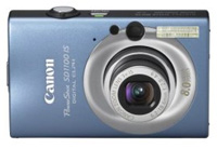
Before food blogging, I’d never bothered to open the manual on a point-and-shoot digital camera. However, these little cameras today (see below for mine) are packed with features that you really need to know. My favorite features:
- the setting for “digital macro” shooting: chances are your camera has a setting for close-up or still life photography that will improve your close-up shots immensely. Note: camera makers often use a little flower or tulip icon for this.
- setting the default focus point to center: when it comes to food photography, you don’t want your camera trying to figure out where to focus. Set the camera to focus on the central point, so that you get to choose where to focus. Once you’ve got the camera focused appropriately for your shot, you can then shift the way the camera is angled to frame your image as desired (on most models, this would be done while holding the “shutter” button down halfway). Just remember that tilting the camera left, right, up or down will be ok, but if you change the distance of the camera to the object, say by taking a step back, then you need to refocus.
- manual white balance: a lot of models have the ability to manually set the white balance, which in many cases will solve color correction problems (the glorious “orange cast” effect). This is not a panacea, but it will sometimes save you in low light situations.
- the ability to turn off the flash
 One feature I do not use is the manual ISO setting. Bumping up the ISO for low light situations just creates a more grainy image, in my experience. For the record, my camera is a point-and-shoot digital camera, a Canon SD1100. There are a number of other interesting features that I am starting to experiment with, but the above are the standouts so far.
On Lighting
A few things I believe:
- Food photography is so much better in natural light (exceptions made for for cool artsy styles)
- Never use the flash unless you have a high-quality setup like Deb at Smitten Kitchen
- Mirrors are very useful, if you have time to break them out
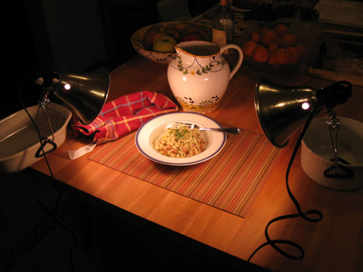
Those of us who cannot shoot in daylight must develop work arounds. Some folks buy fancy lighting equipment and tripods. If you are handy like Jai, you can make your own lighting setup. My problem is that I have no space to keep lighting equipment, nor time to pull it out and set it up, so my current solution is cheap clamp lights that you can get from a hardware store for under $10. Below is an example of my very-temporary setup at the end of the island in our kitchen:

As you can see, it is a bit haphazard but I can set it up and take it down very fast. I just grab the lights (and their extension cord) and a few objects that can hold them in place without tipping over. The necessary distance between the lights and the food will vary, and you may need to angle the lights more indirectly if the type of food is too reflective. Reflections are the downside to this type of lighting — ideally you would defuse the light somehow rather than have a bare bulb, but I haven’t McGuyered up a cover yet that that would stay in place and not freak out a fire inspector.
Other Notes:
- Mirrors and white boards can be great — they reflect light and can even out the lighting in your shot, or remove unwanted shadows. I don’t always have time to grab or use them, however.
- I’ve been playing with a trick where I will hold one of the clamp lights in my left hand, while holding the camera in my right. I’ll press the camera shutter button halfway down to set focus and the light meter, but then I’ll move the light in my left hand around until I get an effect I like. This is how I captured that apple shot with the dramatic lighting at the very top of the post.
- I’ll also note that I have been using Chromalux light bulbs, which I discovered eons ago in my art days, and which cast a warmer, more natural light. You can often find them at art supply shops. However, I’m not really convinced that these are worth the money here, since I still need to solve color balance issues either via manual white balance or Photoshop (see below).
On Photoshop
If you don’t have great camera and lighting equipment, I don’t see how you can get the right color balance for your shots without either: 1. effective use of your camera’s manual white balance feature, or 2. by having good image editing software (I use Photoshop). In truth, I usually try both. I take at least one shot using automatic white balance (which is then edited in Photoshop), and one shot using manual white balance. I never quite know which method will produce a better image – it really varies.
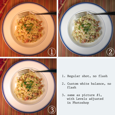
Below is a crude example of what I am talking about. Shot #1 was taken with the camera on automatic — it shows that typical orange cast that needs to be fixed in Photoshop, the results of which are #3. Shot #2 shows the image without any Photoshop editing, but with manual white balance set on the camera.
Photoshop – Levels
While I might use a number of different tools in Photoshop for a particular image (Hue/Saturation, Color Balance, Brightness/Contrast, etc), the feature I use most often is the manual setting of Levels.
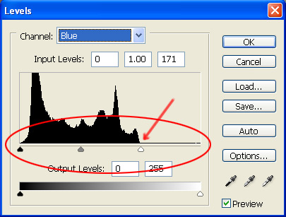
When you open your picture in Photoshop, you can go to Image > Adjustments > Levels and you will see something like the below pop-up. To keep things simple, focus on the three little arrows under the histogram (one black, one grey, one white). These arrows help you set the brightness, shadows and midpoint of the image. You will also note that you can change the “Channel” you are working on (circled in red).
The RGB channel will make changes to the composite image should you just want to work on shadows and brightness. However, if you have color correction to do, you’ll want to look at each of the Red, Green, and Blue channels.
You’ll want to experiment, but to keep things simple, I will note that you can fix a lot of color problems by going to each Level channel and dragging the black and white arrows under the histogram to the point where the histogram starts (i.e. where you see a rise off of the baseline – see the red arrow in image below). Sometimes it takes a little fiddling to get a picture you are happy with, but this tool will take you a long way forward.
Photoshop – Saturation
I am not a fan of people who use Photoshop to blast out their color saturation (i.e. carrots with an orange that could light up the Tokyo skyline). I will sometimes use the Hue/Saturation tool to tone down an image, or a particular color, where color correction has increased saturation too much for my taste. However, sometimes computer monitors are to blame here, and it is just a problem that comes with Web. We can’t control what computers our readers are using. Different monitors will show color very differently. Mac and Windows machines also have really different default settings.
Photoshop – Unsharp Mask
The Unsharp Mask filter can be useful when working with point-and-shoot JPGs. Some images which theoretically should be in focus, don’t always look that way once they are shrunk down. This filter can help, and don’t let the name fool you (it neither unsharpens nor is related to Photoshop’s masking features).
When Photoshop sharpens an image, it increases the contrast between neighboring pixels, or pixels on an “edge” in the image, and Unsharp Mask gives you a fair amount of control over this. There are three settings:
- Amount: the strength of the sharpen effect (on a 400×300 pixel image, I usually use 25 to 35)
- Radius: determines the thickness of the sharpened edge (on a 400×300 pixel image, I usually use 1 or 0.5)
- Threshold: determines what Photoshop recognizes as an edge — the higher the number, the fewer points of contrast will be considered edges (on a 400×300 pixel image, I usually use 3 or 4; I find zero to be harsh in most cases)
I don’t always use this filter, and I will pass on a word of warning: be really conservative using Unsharp Mask on images where you have light reflections off of liquid or oil. It doesn’t look good.
Photoshop can be an overwhelming application, but it is truly amazing. I’ve only scratched the surface of it, and learned most of what I know through the Photoshop CS2 Bible, Professional Edition, and highly recommend that book although it costs a small fortune.
Lots of Pictures
Even though I am moving fast, I usually take several different type of shots, since I don’t know what I will like until I get to look at them. I’ll try an angle shot, a vertical looking-down shot, a super close-up, etc. That’s the great thing about digital cameras — you can take lots of pictures.
Final Notes and Links
I know I didn’t spend any time on aesthetics, but really I view that as a hugely subjective realm. Everyone has their own taste and needs to feel confident in developing their own style. Have confidence in yourself, even if you hate your own results for a while as you improve. Look at lots of pictures on blogs, flickr, cookbooks and magazines, and think about what you like, don’t like, and why.
Here are some links to other food blog photo tutorials that you might check out, in no particular order:
- Foodbeam
- Tartlette via My Cooking Hut
- Smitten Kitchen
- No Recipes on Adobe Lightroom
- Simply Recipes
- 101 Cookbooks
- MattBites
- Still Life With
- O’Reilly
- Food Portfolio
I hope some of this was useful to a few of you out there in the food blogosphere. If you have tips from your own experiments and lessons, I’d love to hear them!


